I joined a startup group within Alpine Electronics as a Sr Engineer where we focused on developing a 3rd party infotainment system and rear seat entertainment casting system (similar to what a AirPlay/Chromecast does) based on some custom hardware built on top of Android. I helped the group in many ways using AWS, web technologies, NodeJS, and MongoDB. As one of my first projects on the team, I updated our local intranet site we had for the team with Bootstrap to create better structure, add additional functionality, and enhanced the visual aesthetics.
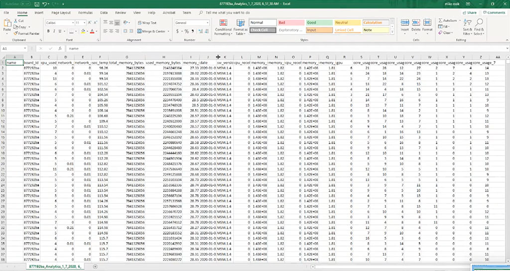
One of the projects I was tasked with was creating an API to track a lot of the stats (CPU/Mem/Event Markers/etc…) the radios would send in real time while in use. The task was to host the data online, provide a dynamic chart of the data, and download an exportable spreadsheet of the data. I turned to AWS Elastic Cloud services to create an Linux Ubuntu virtual machine in the cloud that would host my NodeJS server and MongoDB database.
The site was password protected and hosted on a domain that wasn’t indexed. I used a bunch of the free credits I was provided when setting up my AWS account to host this virtual machine on a very cheap/free t2.micro instance. I had all of the machines that would be online show up in the dropdown box as a source to check on.

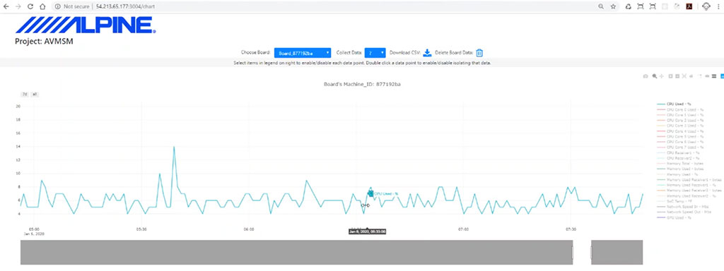
Once you chose a machine, the data would load in a Plotly.js chart. This charting library was very helpful in providing quick visual feedback on the large amount of received data. I built the backend with a bunch of routes in NodeJS for the data to be send to and read from. The front end was primarily HTML and vanilla Javascript with some JQuery and Bootstrap to help.

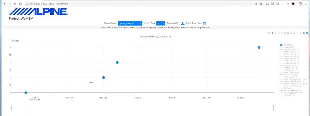
Some of the data points included event markers. These were explicit markers set by users, or the software when something weird would happen to the radio or a problem would be logged. That way we were remotely able to quickly see what was happening to the radios in realtime as issues would occur.

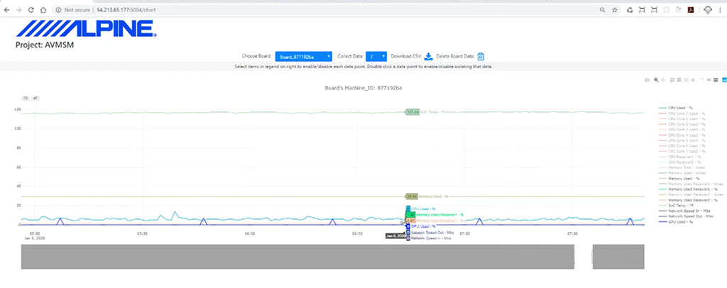
The chart made it very easy to track all sorts of data the radios were providing. It enabled one to turn on and view multiple data points at once, or just one at a time (depending on what data was chosen on the right side of the chart). MongoDB turned out to be a great solution for this as it quickly inserted, queried, and provided the data we needed without noticeable latency.

Creating this as a web solution made it very easy to see lots of data very quickly and from any location. The data could also be exported out to a spreadsheet for further analysis.


